Quarto
Brand identity for an international publishing group.
Category

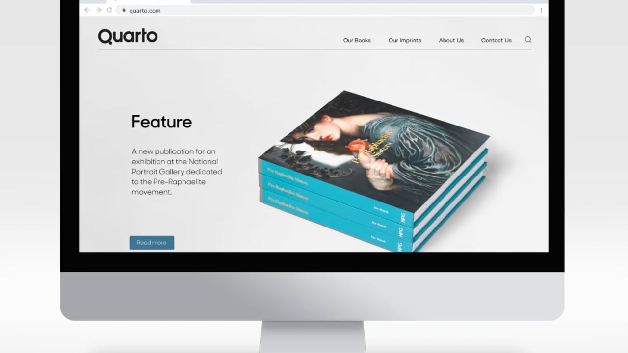
Pentagram has designed the new identity for publishing group Quarto. Established in 1976, Quarto is a global leader in illustrated non-fiction publishing, making and selling books that set out to entertain, educate, and enrich the lives of adults and children around the world.
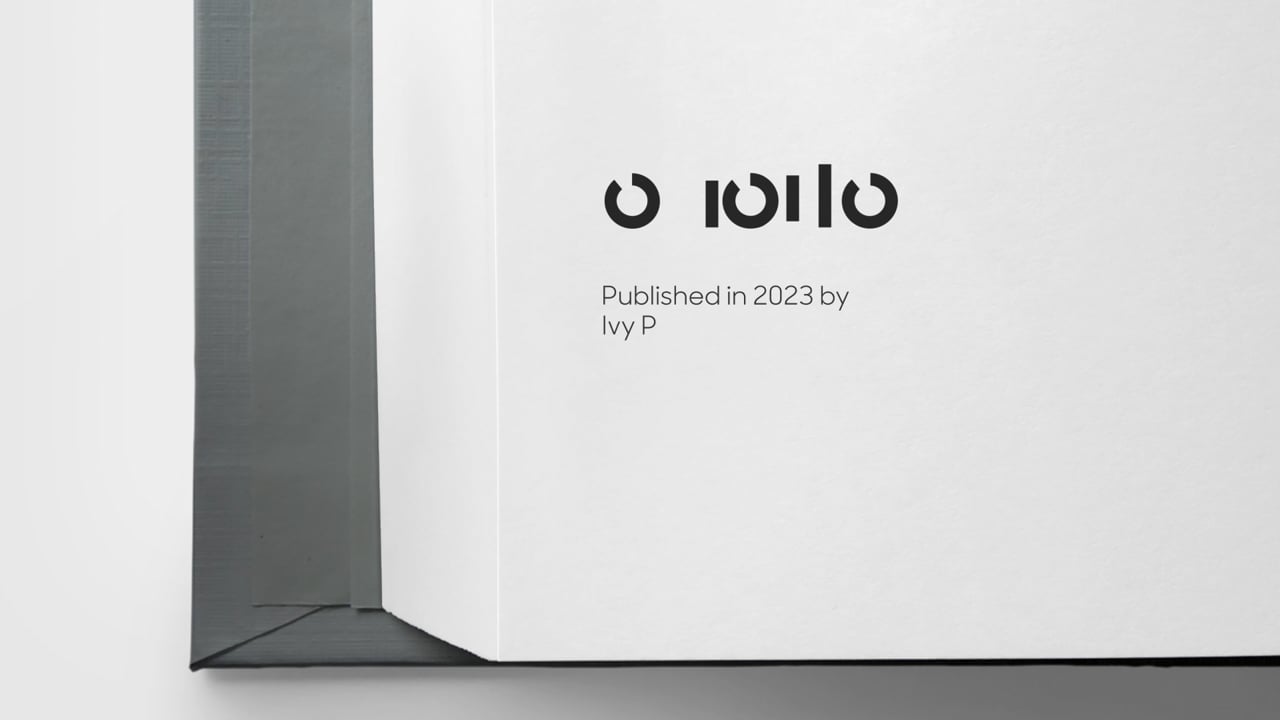
In book production, ‘quarto’ refers to how a printed sheet is folded in four to make up an eight-page signature (or section) within a section-sewn book. The literal translation of Quarto from Latin is ‘fourth’ or ‘quarter,’ and these points of reference inform the design of the brand assets.


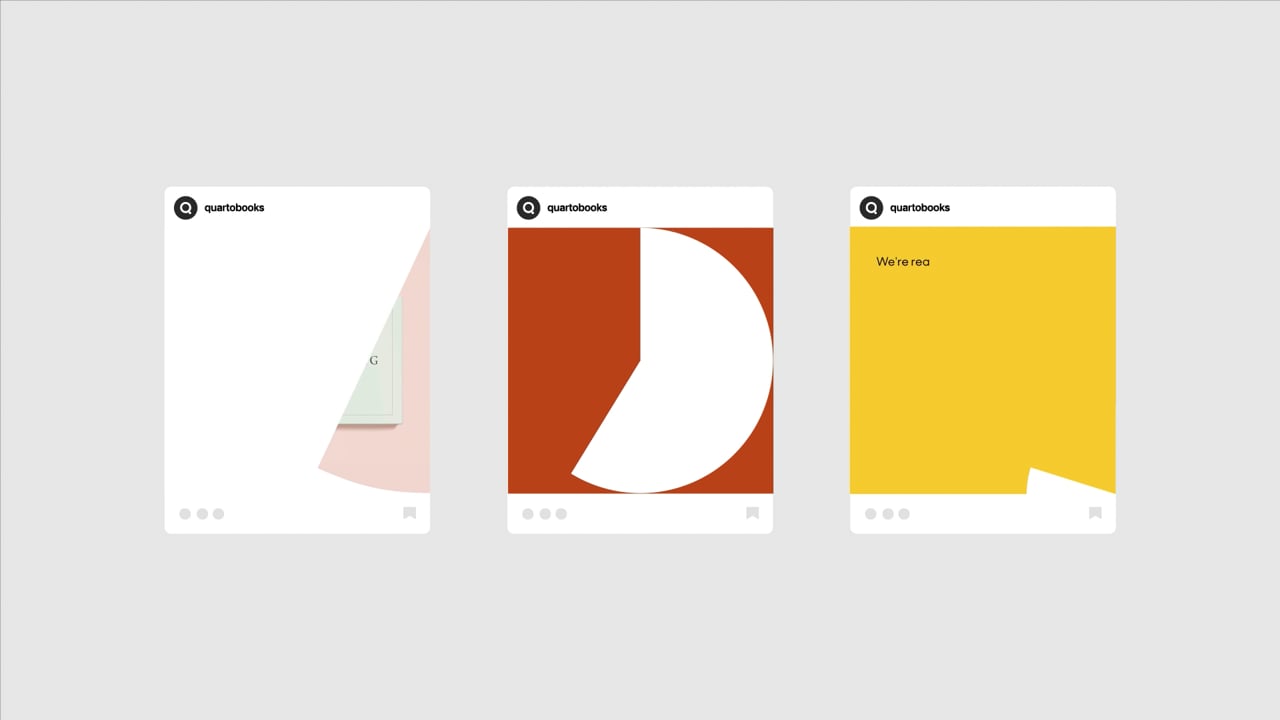
The use of geometric, circular forms in the logo alludes to the idea of ‘wholes’ and fractions. The main colour palette consists of four colours for each of the seasons and the graphic elements all derive from quarter divisions of a circle. Sharp Sans from Sharp Type Foundry was chosen due to its complementary geometric, circular forms that work well with the new Quarto logo and overall approach to the visual identity.